We’ve recently been focusing on how to build the ideal checkout experience that will convert shoppers into buyers. We compared the checkout pages for some major companies (Hulu vs. Netflix and Walgreens vs. CVS) and identified the winners. We also published an index that reviewed 650 merchants and identified what attributes define the optimal online shopping and checkout experience.
Of course, there are an endless variety of checkout pages, and the best approach for you is going to depend on what you’re selling, the payment methods you accept, what countries you’re selling in, whether you offer subscriptions or only one-time payments, and so on.
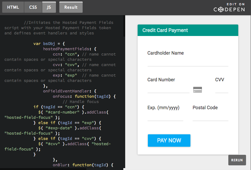
Still, we wanted to make building the ideal checkout form a little easier on you, so we have developed a couple of baseline forms that you can use as a launching point when you are building your own. These are designed to work with our lightweight and flexible Payment API, and they use our Hosted Payment Fields so you have the lowest PCI compliance burden (SAQ-A).
Both of these examples include only credit card payments, but remember that you may also want to offer other payment methods to give shopper more options.
Version 1: Couldn’t be simpler
This is as simple as it gets. Just the shopper name and the credit card fields. No address, no email, no phone. That’s the ultimate in frictionless checkout.
If the shopper can fill out these four fields and click Pay Now, then you’ve just made a sale. Probably. Unless there is a fraud or approval issue, which is why we made version two.
Version 2: More approvals, less fraud
By adding just one more field – the Postal Code (or ZIP Code in the US) – you increase the chances of the sale actually going through once the shopper hits the submit button. Many credit card companies provide a better approval rate if you send in the postal code associated with the card, and some credit cards may not approve any transactions without the postal code. The postal code can also guard against fraud, another reason why it is recommended to include it on your form.
All in all, we’d go with version two of this form for credit card payments. It still has minimal fields, but has the info needed to get you better conversion rates.
Feel free to copy this code, fork it, or suggest improvements. Build the checkout form that will turn your shoppers into buyers!
Developer Notes
Styles:
Hosted Payment Fields are iframes within <div> containers, and they are nearly invisible in terms of styling. The iframes do not have a border and their width and height are 100%. Input inside the iframes has no border margin or padding, a width and height of 100%, and a transparent background.
The majority of the styling is applied through CSS as usual, while styling within the Hosted Payment Fields is applied through the style property inside the JS.
For version 1, we used standard Bootstrap styles, while we gave version 2 a Material UI look by using Material Design for Bootstrap.
Note you can also set custom placeholders for the Hosted Payment Fields within the JS.
Event handlers:
You have all the usual event handlers for the Hosted Payment Fields, such as onFocus, onBlur, onValid and so on. These all take the tagId for each specific Hosted Payment Field.
BlueSnap returns specific errors codes per field, as shown in the examples.
In addition, we provide a built-in way to automatically show the relevant icon per card type. You can use the icons provided by BlueSnap or your own icons.
Hosted Payment Fields tutorial:
For an end-to-end walkthrough of how to implement Hosted Payment Fields and then use the generated token to process payments via BlueSnap’s Payment API, see the documentation in our Developer Hub.

