
 Sandbox
 Production
Fill in the blanks:
Most online checkout pages are (adjective) and (adjective).
I don’t know about you, but I’d fill in “intimidating” and “time-consuming” (and maybe a couple of other words I can’t say here). You can switch out the adjectives, but the point remains the same: I’m betting that your checkout page is probably about as appealing to your customers as a Star Wars marathon is to Star Trek fans (I’m not saying which side I’m on, sorry).
That’s a problem. Your checkout page is a critical piece of your brand’s user experience, so if your shoppers aren’t enjoying the process right down to inputting the last number in their credit card sequence, the risk of user abandonment is real. At any moment, they might come to their senses and:
- Realize they’re spending money
- Remember why they hate filling out form fields
- Get distracted if the process takes more than 30 seconds
So, what does it take to create a payment page that’s frictionless? I dug around for some exemplary payment page examples, which you’ll find below, along with a few notes about their appeal. Take a look and see how your own payment page design compares.
4 Stellar Payment Page Design Examples
1. Figma
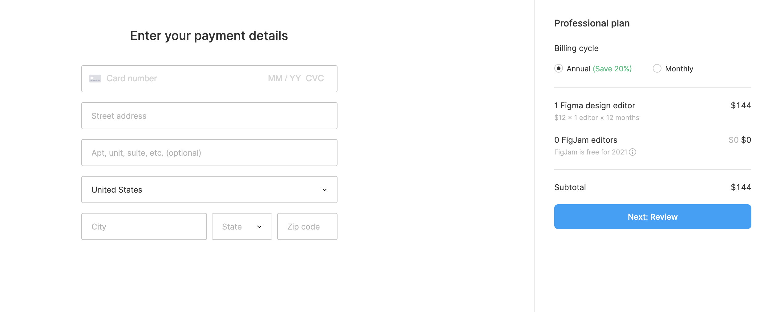
Why I like it: It’s simple, clean and keeps form fields to a minimum.
Clean, clean, clean — this page is simple times 10. And payment information is kept to a minimum. As a merchant, the only fields you really need to complete a debit or credit card transaction online are the customer’s card number, the card expiration date and the card security code (CVC/CVV). All other information is extraneous (though a zip code is often recommended to help reduce instances of fraud). If you can’t get away with those fields alone, keep the form as simple as possible. I’m feeling so good here, I’d probably be willing to shell out whatever amount was necessary to get hold of that design editor.
2. ClickUp
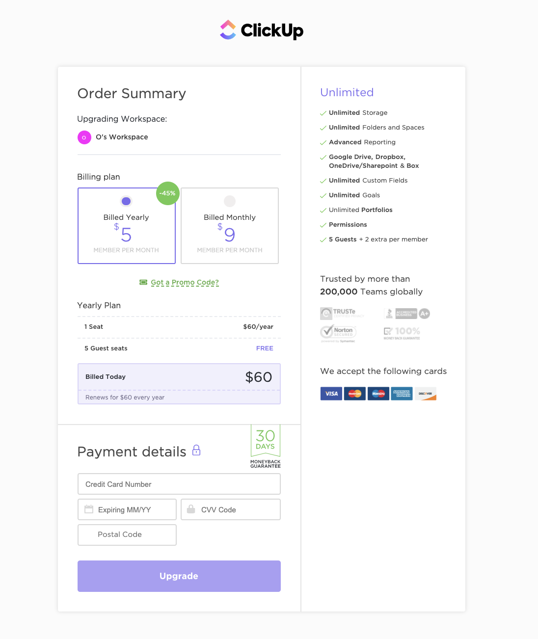
Why I like it: There are no distractions.
It’s a mistake to design a checkout page with your usual navigation menu at the top. Think about it: You’ve worked so hard to bring potential customers to this point; once they’re here, don’t bother them! Like this page from ClickUp, get what you need to complete the sale and keep the process moving. The best checkout pages don’t give customers an opportunity to wander off, even if it’s right back into your store, because every delay holds the potential for disrupting the sale altogether.
I also like the way ClickUp uses the checkout to upgrade the sale right there without any no danger of getting lost in the site.
3. Prezi
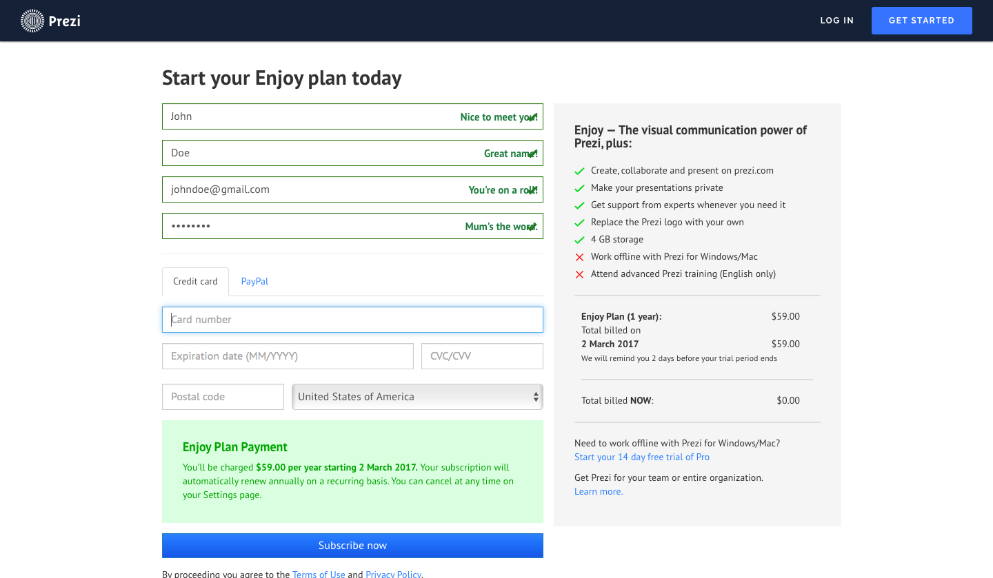
Why I like it: It makes me happy. Literally.
OK, so they’re asking me for a bit more information than I typically like (I wish I didn’t have to open an account to buy their product), but I actually smiled when I was filling out the form fields at the messages that popped up as a result of my answers (I agree, my name is great). Payments are important, but that doesn’t mean they have to put us to sleep. If your company has any personality lurking underneath that slick payment facade, let it out! It only makes customers happier to be associated with you.
4. Dribbble
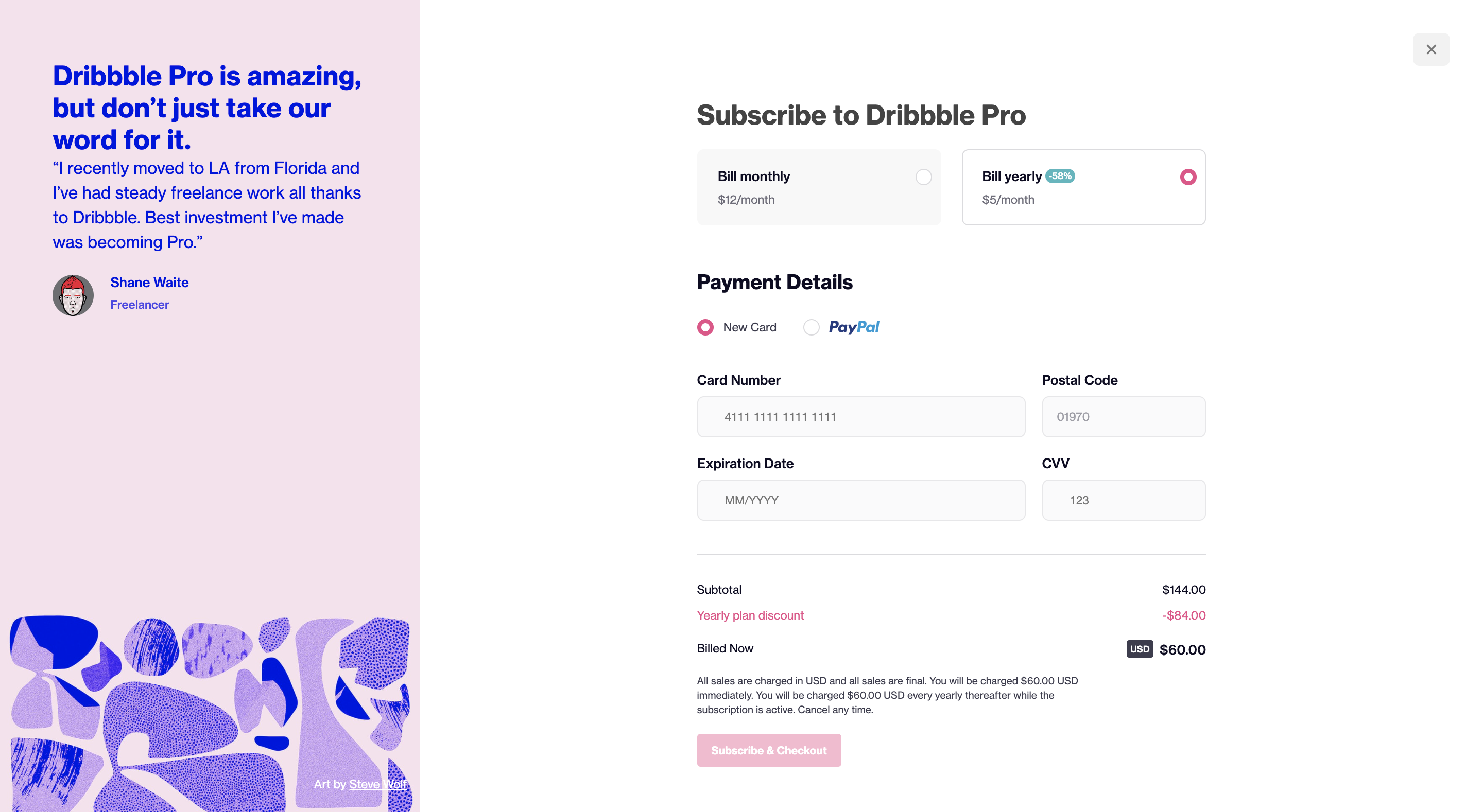
Why I like it: The form incorporates best practices.
Sticking to certain best practices when it comes to designing payment page form fields is key to providing a good checkout experience. Among them:
- Putting spaces between number groups in the 16-digit card number field
- Being clear about the format for inputting dates
- Automatically recognizing the user’s card type
In addition, it’s a beautiful payment page design and not intimidating in any way whatsoever. In short, I wouldn’t hesitate to collaborate with Dribbble on any future activities that involve the decrease of my bank account balance.
Other Payment Page Best Practices
- Keep coupons low-key. Calling attention to coupon and promo codes is like waking up the theoretical tiger. When people see an empty field asking them to insert a coupon code, they immediately want to fill it in — even if they don’t have a coupon. Many customers will leave your site, head to Google and start searching. The internet being what it is makes this the ultimate distraction. People may eventually get pulled away from the task of searching and abandon the purchase altogether or, even worse, stumble on a coupon for the competition. Instead, make the coupon field available for those in possession of this bit of shopper’s gold with some subtle positioning of that tiny phrase, “Have a coupon?” Those who have one will find it; those who don’t will ignore it and continue the checkout process.
- Offer one-click order options like Apple Pay, Google Pay and Click to Pay. By placing these buttons as options on your checkout page, you’re streamlining the payment process to the point of almost being nonexistent. These and other digital wallets are catching on fast among consumers, thanks to their convenience and flexibility; they also offer a greater level of security for both customers and merchants.
How Does Your Payment Page Stack Up?
Now that you’ve seen these examples, take another look at your own checkout page — how does it compare? If some or all of these elements are missing, there’s more you can do to up your payment page game.
BlueSnap’s Payment API makes it easy for you to build a custom checkout experience that truly reflects your brand while we do the heavy lifting on payment processing. Plus, our payment gateway lets you add the one-click order options that make checkout a breeze. Our wide range of payment tools has everything you need to design a high-converting checkout page.
I’ll say it again: Most online checkout pages are… what? If you’re ready to change those adjectives as they apply to your own checkout page, we’re here if you need us!
Related Resources:
- Time for a New Payment Processor [Quiz]
- Does Your Website Checkout Experience Make the Grade?
- Your Checkout Experience Could Be Hurting Your Bottom Line
Frequently Asked Questions
What is a gateway?
A gateway connects the merchant to the acquiring bank where the merchant has opened a merchant account.
How do digital payments work?
Whether for B2B card processing or B2C card transactions, digital payments work the same:
- The gateway captures the transaction request and either encrypts or tokenizes the information, then routes it to an acquiring bank.
- The acquiring bank (which provides your merchant account) takes ownership of the transaction request. Its job is to get authorization for the transaction.
- The issuing bank assesses the request: Does the customer have sufficient credit or funds? The issuing bank generates a response — yes or no — and sends it back to the acquiring bank via the card network.
- The acquiring bank sends the response back to the payment gateway.
- The payment gateway’s final job is to present the answer either back to the merchant or to the shopper directly (if you’re using a hosted payment page).
Congratulations, your order is approved!
Can I use BlueSnap with my eCommerce platform?
Yes – we are integrated with the major eCommerce platforms. See the Integration Partners page for the full list. We continue to add more on a regular basis, so if your preferred integration is not listed, let us know.