It’s a customer’s world and most eCommerce pros are just trying to keep up. Things that surprised and delighted customers one year ago are now viewed as an expected part of the eCommerce customer journey. The disconnect between what a customer wants and what your onsite journey offers can create a series of pain points that prevent customers from completing their purchase. Luckily, many pain points are easily solved with some simple optimizations to your onsite experience.
Challenge: Customers Can’t Find What They Want During the eCommerce Customer Journey
Solution: A visually stunning website can only accomplish so much – as half of the users driven to your site will bounce without looking at more than your landing page.
There are a few ways you can make sure a customer always finds what they’re looking for. First off, don’t overlook SEO metadata descriptions on your product pages. Those minor details are extremely important and play a very vital role in search engine optimization. Google searches, both image and web, favor sites with relevant metadata. What does this mean? The more accurate and detailed you can be, the better. Be sure to use carefully chosen keywords in your meta tags and product titles. Additionally, your URL strings should be relevant and include important keywords that are related to the product or products on the page.
Once a user is on your site, have a tool in place to assist them in finding products they are looking for. Make it an intuitive process by giving the same search options as Google – recommending other products/offerings and refining search terms – directly on your landing page. You can use the keyword string from the search engine that directed users to your site to recreate a similar search onsite and present users with more relevant products.
Challenge: Length of Checkout Process During the eCommerce Customer Journey
Solution: The checkout process is possibly the most important part of your onsite strategy to get right. The customer has remained engaged throughout the user journey and is now at the final hurdle of checking out. Here are three simple ways to improve your checkout process:
Show a Progress Bar
No matter how streamlined your checkout is, making a purchase still requires an investment of time from your customer. Most people accept this, but they still want to know how long the process will take.
A progress bar that clearly roadmaps the checkout journey is a great way of adding clarity to the process. Showing users how far they’ve already come gives that little bit of extra motivation to continue through to the confirmation page. As best practice, the whole process should ideally contain no more than 5 stages.
Haggar Clothing has a transparent checkout process with a progress bar highlighting each step in the customer’s journey. The checkout process does not exceed five steps and it outlines each step along the way so customers know what to expect next.
One Page Maximum
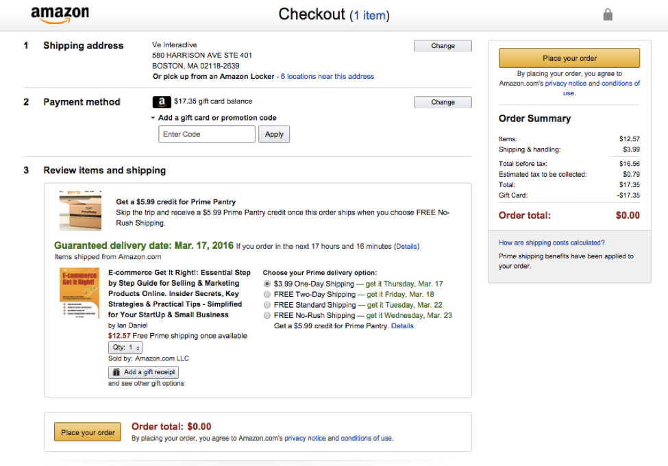
The ultimate goal is to create a checkout that’s no more than one page. A great example of this is Amazon’s checkout page.
It captures all the information needed in three simple sections: Shipping Address, payment method, review items and shipping. ‘Buy now’ and ‘add to wish list’ options were offered during the browsing process, but once the checkout process begins, customers are given only two options: Place your order or close the window. This ensures that once shoppers are ready to buy, they are not distracted and they can complete their purchase without unnecessary distractions.
Eliminate Unnecessary Fields
But don’t eliminate fields for the sake of brevity. Examine your funnel analytics – if you don’t have a funnel analysis tool, there’s no time like the present to invest in one.
A funnel analysis will show you at a page, product and field level where users are dropping off in your checkout process. Is there a specific field where a majority of your users drop off? If yes, can you eliminate that field? For example, instead of requiring city, state, zip code and country, require the zip code. At checkout you can use a look up table to match and populate the corresponding city, state and country from the zip code in the checkout form:


