
 Sandbox
 Production
In my job as a product manager/product designer for BlueSnap, I think a lot about human-centered design. Whenever I start working on a new project, the first thing I do is put myself in the user’s shoes. Why would they be using it? What are they trying to achieve? What do they want their experience to be like? The more often I do it, the more I’ve come to realize that it’s not rocket science—it’s basic empathy.
I think the same holds true for eCommerce websites. The best website designers think of their users first: Why are they coming to visit? If the site clearly addresses that purpose in an efficient, effective, and delightful way, I’d say it can be counted as a success.
Below are some examples of eCommerce websites I most admire, because I think they have achieved the goal above—take a look.
(Among The) Best eCommerce Website Design Examples
1. Apple
It’s a little cliché, but Apple does it right. The site overall is very well organized and extremely easy to navigate. Large, high-quality product images throughout draw consumers in. Plus, Apple provides a great checkout experience to boot. This is what the shopper experience should be like on every website.

2. Snapchat Spectacles
Snapchat does a great job with this site. Purchase one of those spectacles and you’ll see what I mean by “smooth checkout flow.” Snapchat even has Apple Pay as a payment method on its checkout page (woo hoo!).

Web agencies and developers—find out more about the benefits of using BlueSnap as your payment gateway partner!
3. Gorgias
With good color combinations, a layout that’s easy to read, and plenty of white space, the Gorgias site is simply stunning. Enough said.
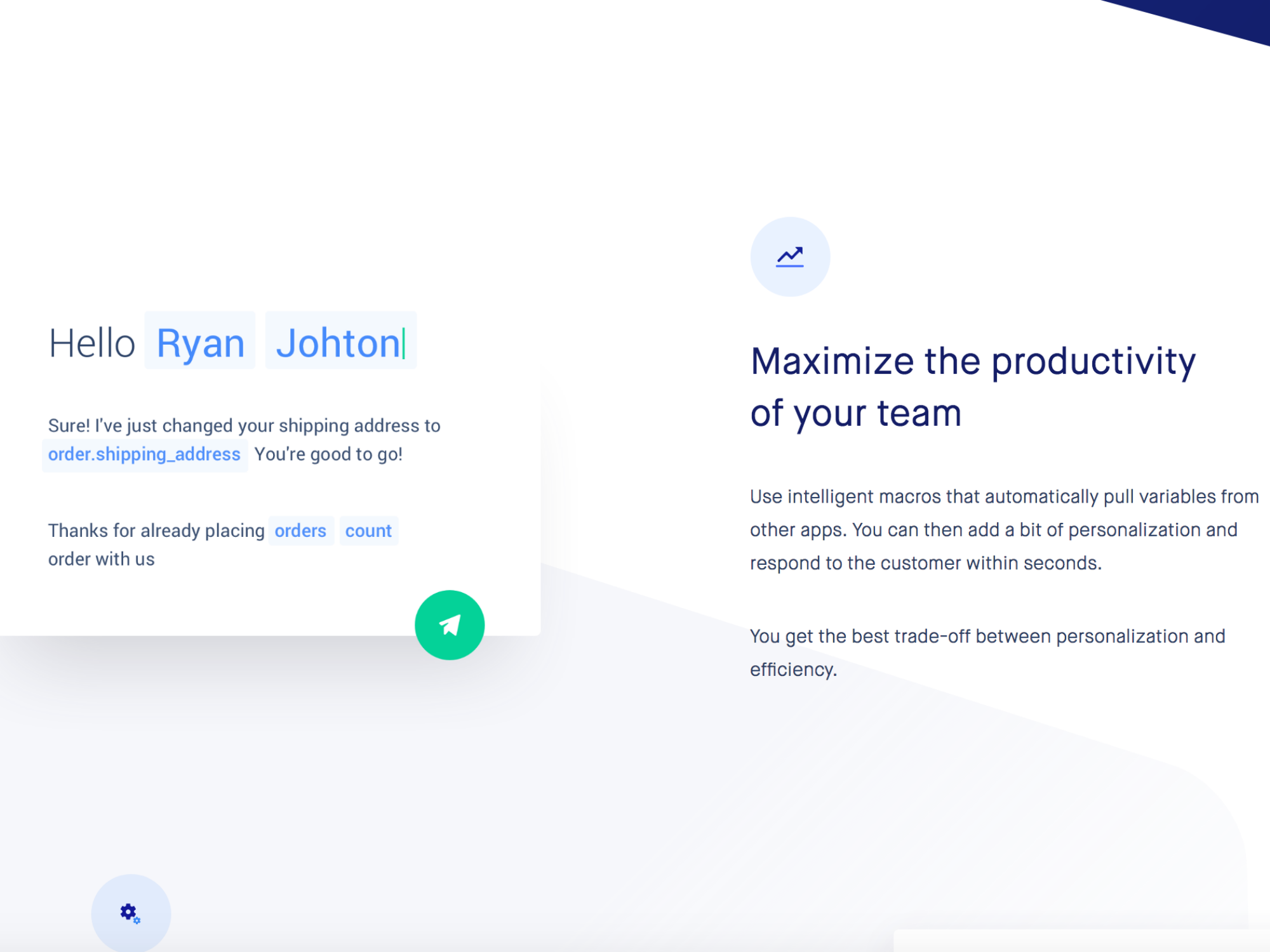
4. Onfleet
This site has a clean, elegant design. It’s also chock-full of examples and demonstrations showing how Onfleet’s tracking/delivery management software works. An added bonus: nice micro animations create a beautiful visual harmony (check out the Features page to see what I mean).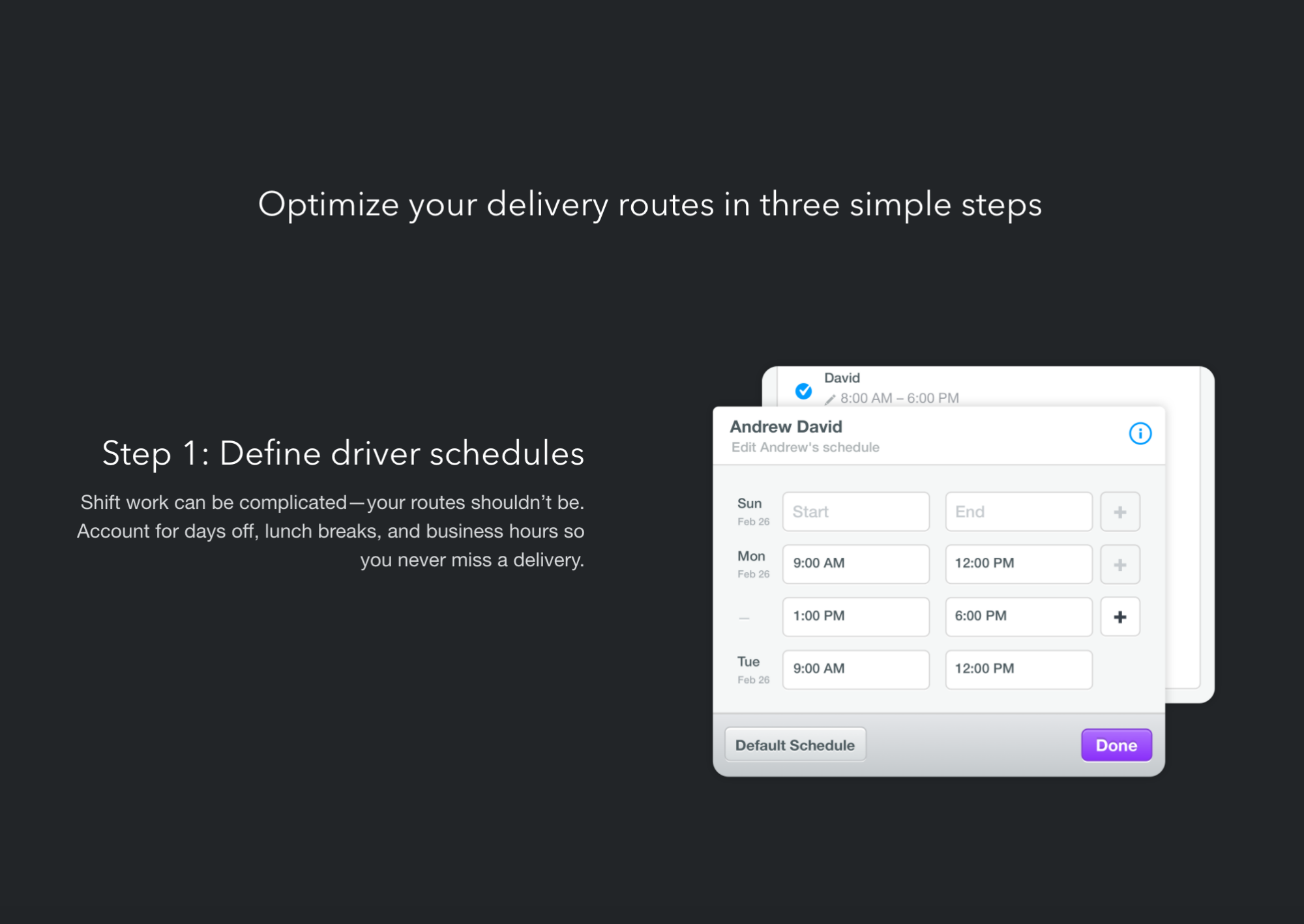

5. Lookback
Refreshing, happy visuals make visitors feel welcome, and the typography choice enhances the positive vibe. There’s also an excellent product video that helps users understand the product right on the home page. Together, it all works like a brilliant welcome mat.
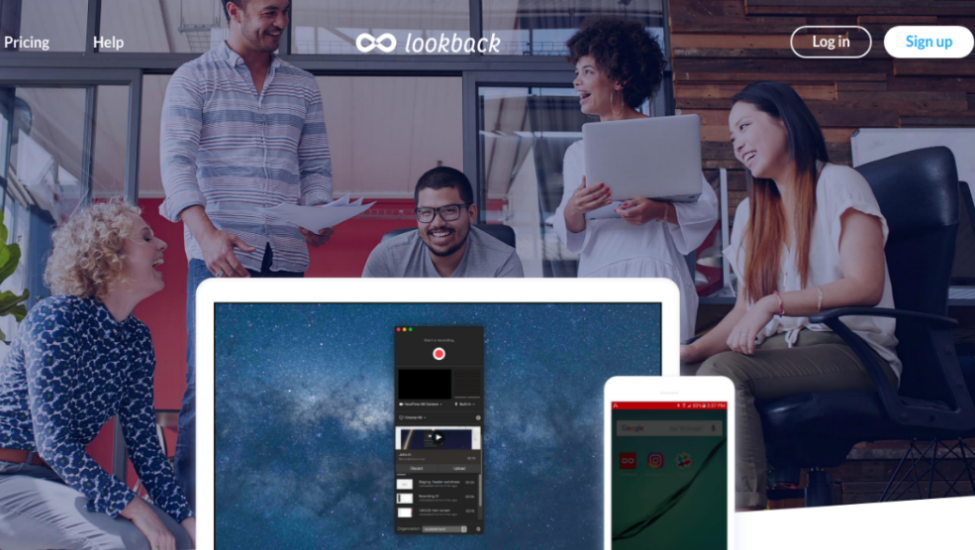
6. Yotti
Yotti is, in my mind, one of the best eCommerce website examples of human-centered design. We all know the gift-buying process can sometimes be difficult, but Yotti solves that problem. Instead of listing product categories, the site asks: “Who are you buying this gift for?” There’s no hesitation in following that line of thinking. Check it out.
7. Framer
There’s no room for confusion about how this product works—the nicely done videos throughout take care of all that. The word static simply doesn’t apply here, which makes the site highly engaging as well as informative.
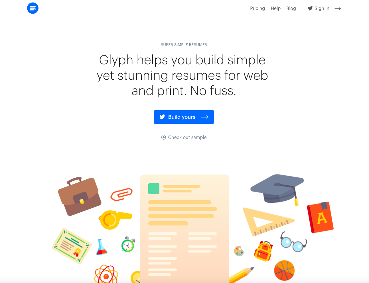
8. Glyph
As you can see from the screenshot below, the Glyph website calls upon a clean design and lean content to get its message across. It does so beautifully.
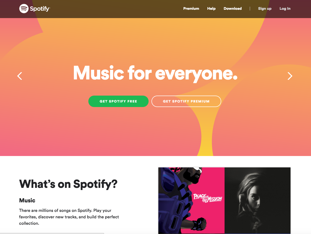
9. Spotify
Creative, attractive, and informative—all the elements on this website make beautiful music together. Plus, it’s incredibly easy to navigate.
Would your website make a list of great eCommerce website examples?
Even if yours isn’t among the eCommerce website examples mentioned above, chances are good that I’ll love it as long as:
- I can find the information that I am looking for easily.
- I can understand what your products or services are without bursting my brain.
- The content is easy to read and understand.
- There are no usability issues, and content flows smoothly.
- It is entertaining, engages me, and makes me happy (not hard to do, I promise you).
- It is responsive and fast.
- It looks elegant, clean, and modern and includes a good amount of white space.
- Everything on the website has a purpose.
- It has micro animations, videos, interactive demos, or other visuals.
- It is human-centered (designed with me in mind).
If you’re currently working on a redesign, here are some tips:
- Know your target audience—exactly who visits your site.
- Know your value proposition—what problems you solve and how that benefits users.
- Know how your products or services are different than those of your competitors.
At BlueSnap, we believe that simplicity and ease of use are among the most important things consumers want from the payment process. If you’re a web agency with the same philosophy, let’s work together! Every customer deserves a seamless and secure online experience, so we design all of our payment services and features to be simple and powerful. Plus, we’re focused on innovation, which means you can offer your clients the most current payment processing tools on the market—today and in the future. And our range of features runs broad and deep, so there’s a BlueSnap payment solution for every eCommerce business, no matter what they sell or how they handle transactions. Check us out, and then get in touch!
Care to share your favorite eCommerce website examples? Tweet us @BlueSnapInc.

Related Resources:
- 3 Signs It’s Time to Reevaluate Your Ecommerce Platform
- Shopping Cart Abandonment vs. Checkout Abandonment: What’s the Difference?
- Merchant Account vs. Payment Gateway: What’s the Difference?
Frequently Asked Questions
Can I use BlueSnap with my eCommerce platform?
Yes – we are integrated with the major eCommerce platforms. See the Integration Partners page for the full list. We continue to add more on a regular basis, so if your preferred integration is not listed, let us know.
What is a gateway?
A gateway connects the merchant to the acquiring bank where the merchant has opened a merchant account.
How do digital payments work?
Whether for B2B card processing or B2C card transactions, digital payments work the same:
- The gateway captures the transaction request and either encrypts or tokenizes the information, then routes it to an acquiring bank.
- The acquiring bank (which provides your merchant account) takes ownership of the transaction request. Its job is to get authorization for the transaction.
- The issuing bank assesses the request: Does the customer have sufficient credit or funds? The issuing bank generates a response — yes or no — and sends it back to the acquiring bank via the card network.
- The acquiring bank sends the response back to the payment gateway.
- The payment gateway’s final job is to present the answer either back to the merchant or to the shopper directly (if you’re using a hosted payment page).
Congratulations, your order is approved!
What is BlueSnap?
BlueSnap helps businesses accept global payments a better way. Our All-in-One Payment Orchestration Platform is designed to increase sales and reduce costs for all businesses accepting payments.
BlueSnap supports payments across all geographies through multiple sales channels such as online and mobile sales, marketplaces, subscriptions, invoice payments and manual orders through a virtual terminal.
And for businesses looking for embedded payments, we offer white-labeled payments for platforms with automated underwriting and onboarding that supports marketplaces and split payments.
With one integration and contract, businesses can sell in over 200 geographies with access to local acquiring in 45+ countries, 110+ currencies and 100+ global payment types, including popular eWallets, automated accounts receivable, world-class fraud protection and chargeback management, built-in solutions for regulation and tax compliance, and unified global reporting to help businesses grow.
Who can use BlueSnap?
Merchants around the world can use BlueSnap to accept payments in 200 geographies with BlueSnap local acquiring in 47.